Earn your college degree 100% online, and launch your creative career
Join classes starting soon in April and May REQUEST INFORMATIONDelivering the Highest Quality Online Education for 25 Years
We are an accredited, fully online school of art and design. Since 1997, we’ve delivered visual arts education to tens of thousands of students around the world.

Which Program Is Right For Me?
Select from an exciting range of accredited programs at Bachelor’s, Associate Degree, and Certificate level.
Bachelor of Fine Arts (BFA)
Illustration

Graphic Design

Digital Photography
Browse programs by majors
Recognized for Quality
DEAC accredited since 2001
Recognized as top design school by GDUSA
Winner of four USDLA awards for distance education
Connect,
Collaborate,
Create.
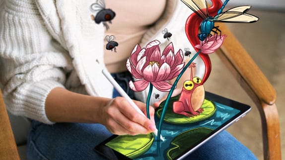
Our programs are designed to advance your creative skills, on your own time. Access our learning environment 24/7 to learn and apply new concepts and techniques on projects that are relevant and fun. Get professional feedback while also building your creative portfolio.
Designed for Everyone
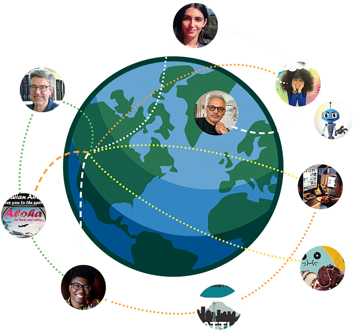
Who studies at Sessions? We proudly serve a diverse and international student body from all walks of life who share a passion for pursuing a creative career.
We’ve worked with adult students with busy life schedules and college age students looking for flexible learning alternatives compared to traditional classrooms. We’ve graduated students from more than 100 countries.
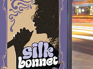
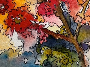
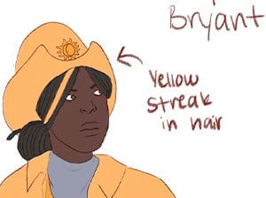
Student Work
Student Work


Online Education You Can Afford
We believe in making education more accessible and affordable.
Talk to our Admissions team and ask about our degree scholarships and financial aid for eligible students.